Magazine Lay Out
Characteristics of a Good Lay Out
- Good use of colour
- Emphasis on main photograph
- Catchy headline
- Eye-catching
- Interesting stories
- What is a font?
A font is a set of printable or displayable text characters in a specific style or size.
- What is the difference between sans and sans serif font?
 A serif font features a small decorative flourish at the ends of the strokes that make up letters and symbols. A sans serif font does not have any flourishes at the ends of their strokes.
- Why do magazines use a variety of fonts and colours?
A variety of fonts and colours are used to attract different specific target audiences to the magazine. This is because different fonts and colours help to create a specific theme.
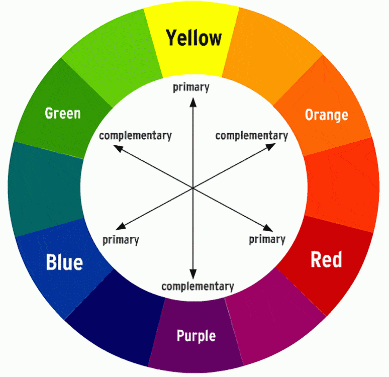
- What is a complimentary colour?
Complementary Colours are any two Hues positioned exactly opposite each other on the Basic Colour wheel
- What is an analogous colour?
Analogous colours are groups of three colours that are next to each other on the colour wheel, with one being the dominant colour, which tends to be a primary or secondary colour, and a tertiary. Red, orange, and red-orange are examples.
- What is a mast head?
The title of a newspaper or magazine at the head of the first or editorial page.
- What is a cover line?
Cover lines are short statements found on the cover of the magazine that allude to or describe the articles inside.
- What is a main cover line?
A main cover line is the biggest/main story featured in the magazine and is the biggest cover line on the front of the magazine.

- What is the left third and the right two third?
The left third of the magazine cover is vital for sales in shops where the magazine is not shown full-frontage.
- Why are barcodes and dates and timelines used?
The date is used so that the buyer knows that the issue is the most current. The barcode is featured so that the magazine can be purchased, and the price is also usually featured here.