Monday, 17 October 2016

Preliminary Task Video

Date-Napped!


Romance/Thriller:
·      Tim and Ryan on a date – 
over the shoulder, 
two shot, 
close up
·      Tim kidnaps Ryan
·      Rebecca puts bag over Ryan’s head – in waitress uniform. 
Mid shot, 
close up of Tim’s eyes when giving signal, 
mid shot on Ryan when bag over head.
·      Kia behind camera
·      Interrogation when Ryan kidnapped – 
studio, black backdrop, spotlight
Mixture of mid shots and close ups.
·      End point – Tim edging in wearing gas mask. 
Mid shot/Close up
·      Ryan narrating the whole video. 

Starts with Tim and Ryan sat down on date. Audience see Tim spike the drink. The pair happily chat and Tim seems all dark and mysterious.  Half way through the date, Ryan seems visibly more drowsy – at this point, you notice that everyone in the restaurant has left, and Rebecca, the waitress, puts a bag over Ryan’s head. Fade to black. Next scene, Ryan is in a room, and a spotlight is put on him. He hears an ominous dark voice asking him questions. To end the video, Tim slowly approaches the camera, wearing a gas mask.

Props:
Gas mask
Ski Mask
Bag
Plates, knives, forks
Rope
Knife

Costumes:
Waitress outfit - Rebecca
Leather jacket, black shirt - Tim
Anything you'd wear to a date/Smart attire - Ryan

Location
Studio in college
Uni centre


Roles
Kia - Camera/Director/Editer
Tim - Actor/Director - Brad
Ryan - Actor - Jack
Rebecca - Actor - Shelly

Script:

INT./ Daytime / Restaurant

Restaurant setting, brightly lit. Open spaces. Centre of town. Two boys sit opposite each other in the restaurant. One is dark and brooding; the other small and petite and innocent looking. They are on a blind date. Brad has dark hair, glasses, leather jacket; seems mysterious and quirky. Jack has light hair, blue eyes, and seems very genuine. 

Jack *voiceover*: It was just a normal day, at first. I'd thought I'd finally got a chance at love.

But that changed pretty quickly.

He seemed normal, to begin with. Dark, mysterious; my usual type. 


Friday, 14 October 2016

Magazine Lay-Out and Design

Magazine Lay-out and Design


This was my very first college magazine lay out design. I managed to feature a title, puff, at least three cover lines, a cover image, bar code and skyline (although it was featured towards the bottom of the page rather than the top.)  Therefore, I designed a lay out for my final draft of my college magazine cover in Powerpoint. 

This layout design features all of the necessary elements listed in the task list. After creating this layout design in Powerpoint for my final draft, I took to Photoshop to begin creating my magazine cover. The final product was this: 

This was an improvement on my initial design for many reasons. Firstly, the cover image is a lot clearer, making the magazine much more attractive to look at. Secondly, I managed to feature all of the necessary requirement, whereas last time I did not. I featured a date and issue number with my bar code at the bottom on this cover. I also featured a puff, three cover-lines featuring a font hierarchy, both serif and sans serif fonts, a sky-line and a title. I chose to make my magazine cover mainly monochrome as I felt it gave it a much more professional touch. However, eventually, with some persuasion, I was convinced to include more colours. I chose to make the main cover-lines red as I felt it went well with the black and white overall tone of the magazine cover, all the while standing out enough to make people actually want to read them. I made my puff bright yellow as the colour highly contrasts with the blacks and greys of the main image, which makes the price of the magazine stand out more, and therefore will lead customers to be drawn to the magazine due to its cheapness. 

Monday, 12 September 2016

Magazine Lay-Out Theory

Magazine Lay Out

Characteristics of a Good Lay Out
  1. Good use of colour
  2. Emphasis on main photograph
  3. Catchy headline
  4. Eye-catching
  5. Interesting stories
  • What is a font?
A font is a set of printable or displayable text characters in a specific style or size. 
Image result for complementary colours
  • What is the difference between sans and sans serif font?
Image result for analogous colorsserif font features a small decorative flourish at the ends of the strokes that make up letters and symbols. A sans serif font does not have any flourishes at the ends of their strokes.
  • Why do magazines use a variety of fonts and colours?
 A variety of fonts and colours are used to attract different specific target audiences to the magazine. This is because different fonts and colours help to create a specific theme. 
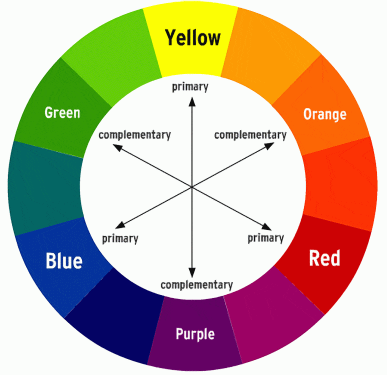
  • What is a complimentary colour?
Complementary Colours are any two Hues positioned exactly opposite each other on the Basic Colour wheel
  • What is an analogous colour?
Analogous colours are groups of three colours that are next to each other on the colour wheel, with one being the dominant colour, which tends to be a primary or secondary colour, and a tertiary. Redorange, and red-orange are examples.
  • What is a mast head?
The title of a newspaper or magazine at the head of the first or editorial page.
  • What is a cover line?
Cover lines are short statements found on the cover of the magazine that allude to or describe the articles inside.
  • What is a main cover line?
A main cover line is the biggest/main story featured in the magazine and is the biggest cover line on the front of the magazine.
Image result for left third magazine
  • What is the left third and the right two third?
The left third of the magazine cover is vital for sales in shops where the magazine is not shown full-frontage.

  • Why are barcodes and dates and timelines used?
The date is used so that the buyer knows that the issue is the most current. The barcode is featured so that the magazine can be purchased, and the price is also usually featured here.